MRDS Gold Resources - Reported Grade Prediction
June 16, 2021
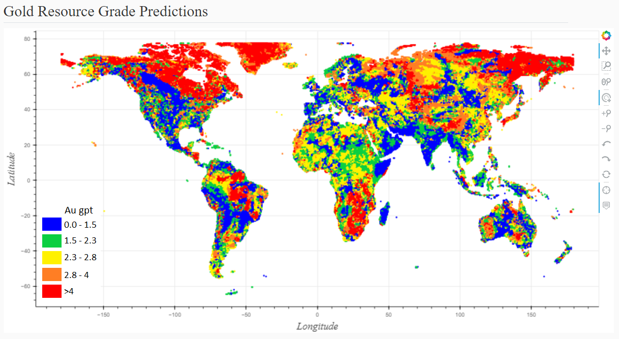
Below I explore the nature of the world’s gold resources, particularly the distribution of grade and the influence regional geology and near-ology (proximity to other deposits) exert on those grades. With the help of a machine learning algorithm, I create a tool for predicting gold grades that also expresses the uncertainty around those predictions. This tool only requires a pair of coordinates as input and the rest is automated. Finally, I push coordinates for most of the world (oceans and Antarctica excluded) through the tool to produce this interactive map (screen-shot below). This work provides context to the grades of gold resources, helping me appreciate how high or low they can get based on location.
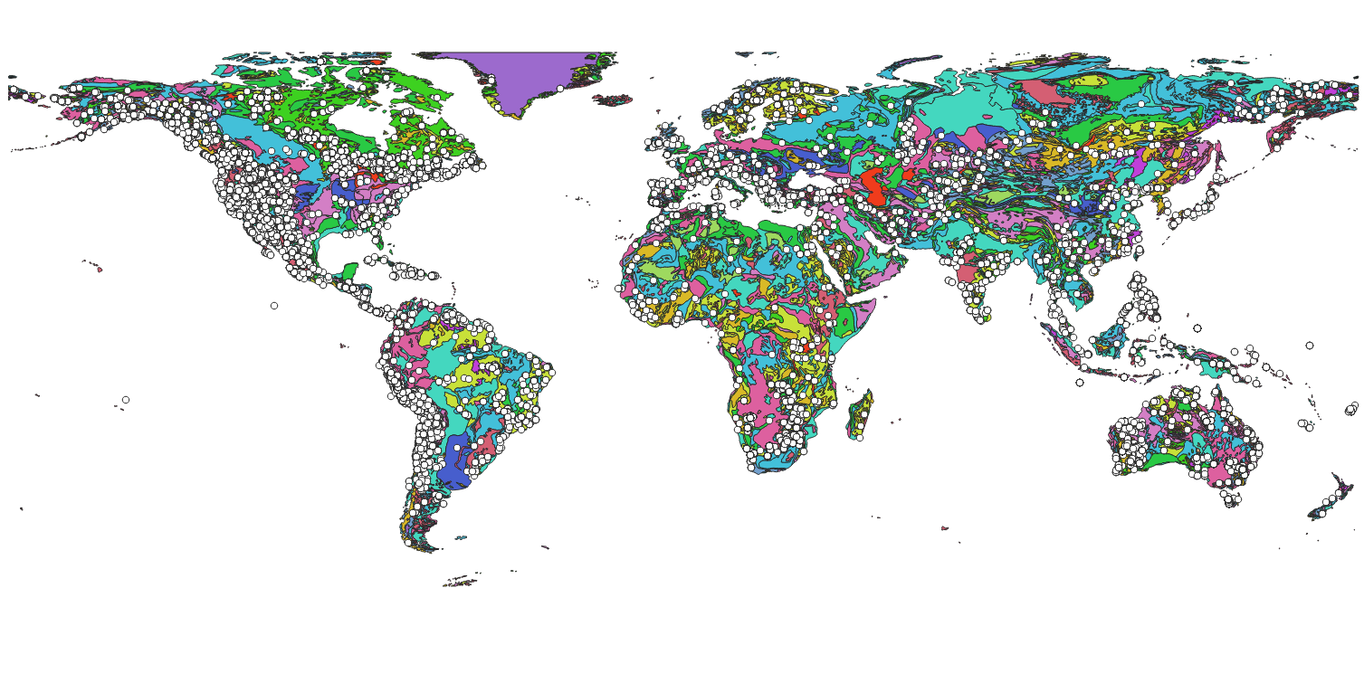
For this exercise, I'm drawing from three datasets: 1) MRDS, 2) GLiM and 3) Lith1.0. The MRDS is a complex database of world mineral deposits. It is made available by the US Geological Survey and was last updated in 2011. Of the large amount of information that can be extracted, I’ll focus on a few key pieces. The first piece is a big one: coordinates. There are coordinates for nearly 300k unique deposits across the globe with a notable bias towards the Americas. In addition to coordinates, the primary commodity of interest for each of these deposits is also available. For about 7k deposits, the MRDS includes reported mineral resources, providing tonnes and grade by commodity. My focus is on those properties with resources.
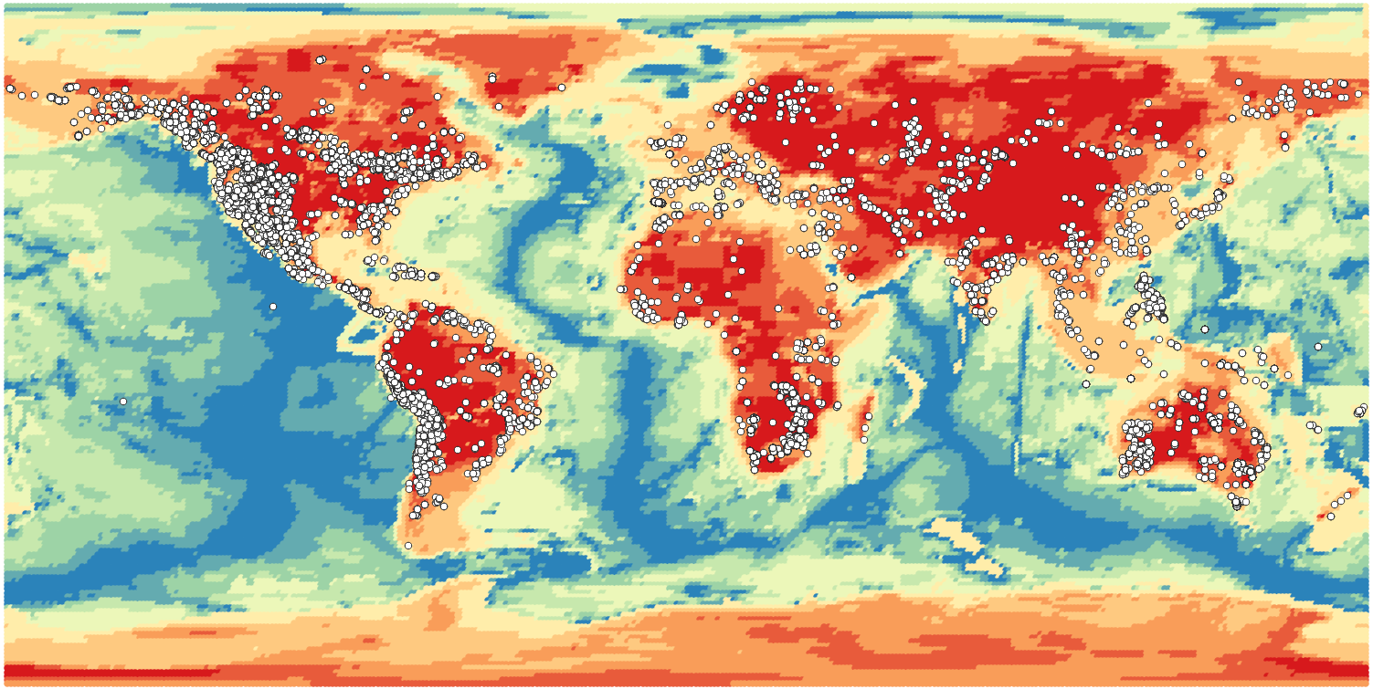
GLim and Lith1.0 are both maps. GLiM is short for Global Lithological Map (Hartmann and Moosdorf, 2012). This is a unified and simplified geologic map of the world conveniently provided as an ESRI Shapefile. Lith1.0 is a model of the lithospheric thickness at a resolution of 1 degree in both Latitude and Longitude (Pasyanos et al., 2013). Both are displayed below overlain by the MRDS.
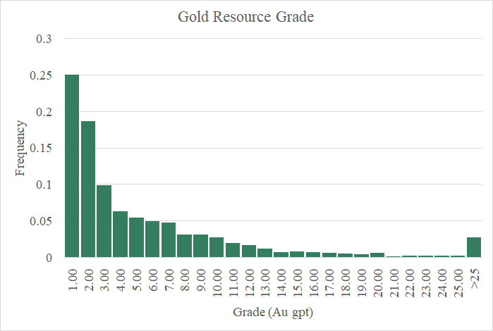
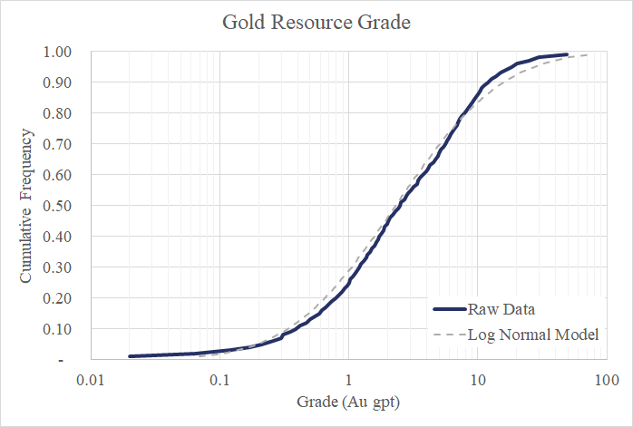
Let’s take a look at the grades of these gold resources in the charts below. You can see there’s considerable positive skewness in the data. From the perspective provided by the histogram (green bar chart), it’s very difficult to discern the nature of the distribution with so many of the values piled into the first bin three bins (0 to 3 Au gpt). The next figure clears things up a bit. Here I’m showing the same data but have switched from a histogram to a cumulative frequency curve with a logarithmic scale for the X axis. At first glance, it appears to me that these values are part of a well behaved lognormal distribution. (i.e. the natural logs of these values are well modeled by a normal distribution). Looking closer at the upper tail, particularly the values above the 80th percentile, suggest a lognormal model for this data is a bit aggressive. In other words, high grade gold deposits are less likely than a lognormal model predicts.
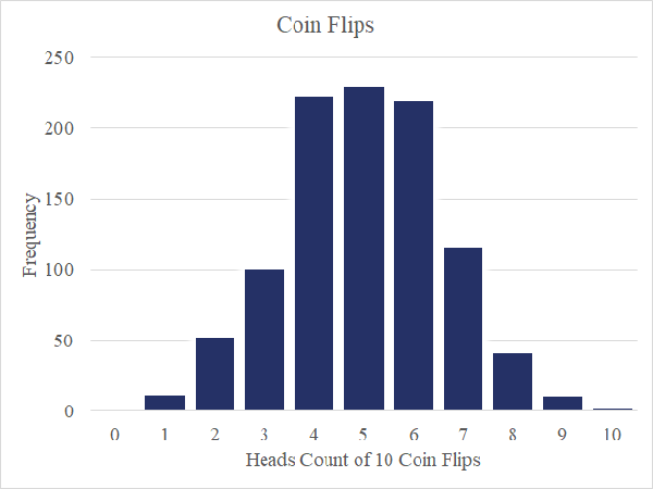
This intensely skewed distribution is not surprising given the nature of mineralization. Let’s take a step back and briefly explore the normal distribution, which served as the foundation for all of the statistics I learned in school. Per the central limit theorem, I can reproduce unexciting, normally-distributed data by flipping coins. For example, I flip a coin ten times and record the number of heads. Repeated 1000 times and plotting those 1000 records on a histogram, I see a nice bell curve as in this figure. From what I know of coins, the odds of flipping heads are not influenced by any of my previous coin flips. Put another way, the coin has no memory.
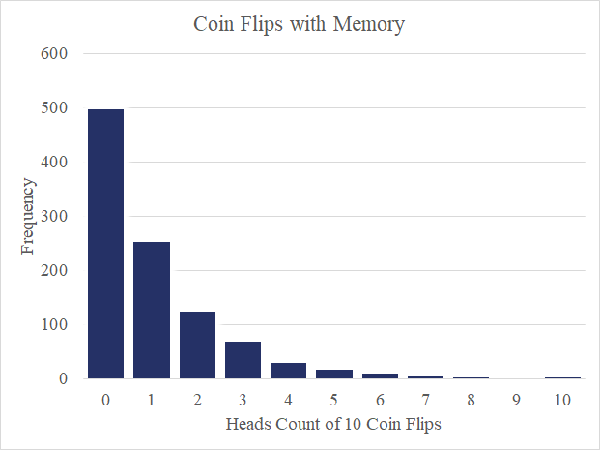
Now imagine I have a magic coin that remembers the past. On the first flip, I’ve still got even odds of flipping heads or tails. However, and here’s the magic, the first time I flip tails, the odds change such that the coin will only return tails for the remainder of the round. The coin remembers. A histogram of 1000 rounds in this scenario displayed below is giving us a positively skewed distribution reminiscent of our gold grade data.
I think the key insight here is that mineralizing systems have a memory. The conditions that allow for a bleb gold laden sulfide to nucleate in a certain part of the world, persist or remain in memory for a time allowing for additional nucleation. Further, the mere presence of a mineral provides inviting nucleation sites, significantly increasing the odds of more mineralization of the same. These types of compounding or multiplicative systems yield the highly skewed results we’re finding in the gold grade data.
The nature of the gold grade distribution is interesting and it starts to focus my intuition about relative gold grade and what we really mean by high and low grade. However, we have yet to consider geography. After all, what’s high grade for a gold deposit in Nevada is not the same as in the Canadian Shield. In other words, there are geographic features of these deposits in addition to grade that are worth knowing.
Here’s why the coordinates are so important. With them, I can append the gold grade data with all manner of new, geographic features. Cross-referencing the deposit locations with the GLiM geologic map of the world, I append generalized lithology to the dataset. I do the same with the Lith1.0 dataset for lithosphere thickness.
What about near-ology? Near-ology is just a more approachable code word for geostatistics. In short, near-ology attempts to identify and extract any useful information about, in this particular case, the grade of a gold resource from neighboring resources. To do that, I construct a few new features to append to the data set. First, is a score where I calculate the inverse distance of a resource to every other resource in the data set and sum them all up. Resources with a high score have a high number of close neighbors. The second takes those same inverse distances and multiplies them by the neighboring resource grades (effectively an inverse distance weighting) and sums those values. The third and fourth features are the same as the first and second, but with one twist. Only neighboring resources with the same commodity (gold in this case) are included in the summations. Now, we’ve got four new features that each have a slightly different take on near-ology. Now, it’s time to put those features to good use.
Of all these great features, which if any have the most power to predict the grade of a gold resource? The RReliefF algorithm scores features for just that purpose and for our newly appended dataset, the top five features are lithosphere depth and my four near-logy features. That said, the extensive lithology data I appended still makes a positive contribution to the end result.
Next step is to train an algorithm to produce a predictive model and assess that model’s precision. After a little experimentation, I chose the AdaBoost algorithm (regressor using decision trees) for the task. It’s job is to identify relationships between gold resource grades and their corresponding feature data. Through a method called 5-fold Cross Validation, I iteratively hide 1/5th of the data from the algorithm, allow it to produce a predictive model from the remaining data, feed the hidden feature data through the newly produced model, then compare the model predictions of gold grade with the known values. This is repeated such that each fifth of the data has a turn being hidden.
So how do the models produced by this algorithm perform? Not bad! Below is a scatter plot from my 5-fold Cross Validation exercise. Each point plots the actual grade for one of the gold resources in the dataset against its predicted grade (when it was hidden from the algorithm). There’s still lots of noise in there, but some signal, as well. We’ve seen the high variability in the gold grade data in those charts above. The algorithm is giving me models that can explain away about 40% of that variability*.
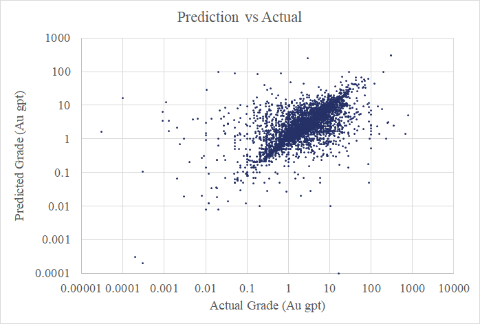
*I'm making this claim after using a Box-Cox Transformation to re-shape the data into a nearly Gaussian Distribution and comparing Mean Absolute Deviation of the actual and predicted grades.
I am providing access to my predictive model for gold resource grades via two tools. The first requires a user to input any pair of world coordinates in degrees longitude and latitude. Below is an example for a coordinate pair in the center of Nevada. The geographic features (i.e. geology, lithology, lithosphere depth, and near-ology scores) are computed automatically for that particular location and fed through the predictive model. The output is a pair of cumulative frequency curves. One is simply the frequency distribution of the raw MRDS data for gold resource grades (‘Raw’) for reference. The other is the predicted frequency distribution for the coordinates provided (‘ML Model’).
Here are a few notable numbers from the ML Model: the 25th percentile is 1.4 gpt, the 50th is 3.1 gpt and the 90th percentile is 11.2 gpt. Okay, that’s a lot of numbers, but let me go a bit further and be extra-explicit about what this predicted frequency distribution means to me: If a gold resource existed at this location and that resource was deemed interesting enough by the US Geological Survey to include in the MRDS, I’m giving it one chance in four of having a grade greater than 1.4, one chance in two of having a grade greater than 3.1, and one chance in ten of exceeding 11.2 gpt. The 50th percentile is the value output from my predictive model. The shape of the distribution (not-quite-lognormal) was a subjective call I made after playing with the raw data. The spread of that distribution came from the 5-fold cross-validation work I completed while training the machine learning algorithm.
I can be even more explicit, but first I better re-introduce the second tool, which is my gold grade map of the world. Having set up a system to use the predictive model with only providing a pair of coordinates, the next logical thing to do is feed every coordinate in the world into the model and plot the predictions on a map. Doing so (ignoring the oceans and Antarctica) gives me this map, which I showed earlier.
It’s very tempting for me to conclude, based on this map, that the geology and near-ology of Northern Canada make it a great place to go looking for gold deposits. Now, I happen to believe that’s true, but there’s a human element captured in this map that must be appreciated. Given that this is the US Geological Survey’s data I’m working with, I am suspicious that low-grade deposits are better represented in the US than in other regions. This would lower my modeled grade expectations for the US. Also, it can be expensive working in Northern Canada or other cold regions, such that humans are not interested in doing a lot of work reporting resources for lower grade deposits therein, effectively filtering them from the dataset. Similar filtering could occur in regions where deposits run deep requiring greater costs to exploit them. Human laziness aside, it is also important to note that this map is not expressing the probability of locating a resource, only setting expectations of grade conditional on a resource existing.
It would be nice to have similar maps showing the odds of finding a gold resource, predictions of contained metal, and even sets of maps for different elements (copper, silver, etc.). Also, it would be great to get my hands on some more extensive and potentially less biased data such as the pricey SNL database provided by S&P Global and re-work this analysis, hopefully squeezing out some additional uncertainty. I will pursue these ideas in the near future. Register to my site and I'll notify you by email when new tools come online!